Cleaning, Analyzing, and Visualizing United States Covid-19 Data In Excel
Motivation
Covid-19 is a very serious disease that has wreaked havoc amongst the world over the last three years. The disease has killed millions of people throughout the world so it is vitally important that we as a society continue to build our knowledge of this disease and its effects so that we are better protected and prepared for however this disease continues to advance. That is why when I found a data set on how covid-19 is affecting each state in the United States I was very eager to use my data analytic skills in excel to help build my own and others' understanding of this terrible disease.
Cleaning
Before

After
Changes
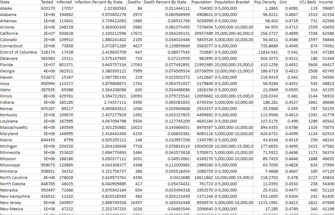
One of the first changes was fixing the width of all the cells so that all text could be easily readable.
The next change that was done was adding the columns "Infection Percent By State" and "Death Percent By State". This was done so that a person viewing the data could get an easier understanding of how likely it is for someone to get infected or die in each state from covid-19. These columns were done by diving the number infected or died by the total population of the state and then multiplying by 100 with the code "=(C2/G2)*100".
Another change was adding a new bracket column for the population. This was done so that visually things would not look too busy when reading the charts and graphs on the dashboard. The way that these brackets were created was by writing a long "if and" statement as seen here: "=IF(AND(G2>35000000,G2<40000000),"35,000,000-40,000,000",IF(AND(G2>30000000,G2<35000000),"30,000,000-35,000,000",IF(AND(G2>25000000,G2<30000000),"25,000,000-30,000,000",IF(AND(G2>20000000,G2<25000000),"20,000,000-25,000,000",IF(AND(G2>15000000,G2<20000000),"15,000,000-20,000,000",IF(AND(G2>10000000,G2<15000000),"10,000,000-15,000,000",IF(AND(G2>5000000,G2<10000000),"5,000,000-10,000,000",IF(AND(G2>0,G2<5000000),"0-5,000,000","Invalid"))))))))"
Analyzing
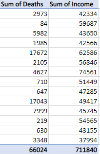
After the cleaning step comes analyzing. One of the questions that I came up with that I was most intrigued by and wanted to find the answer to was "Does poverty have an effect on your likelihood of dying of covid-19". In order to find out this answer a Pivot table was created.
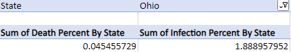
Another question that I had was "What is the comparison between infection percent and death percent". A pivot table was also used to find a conclusion to that question.
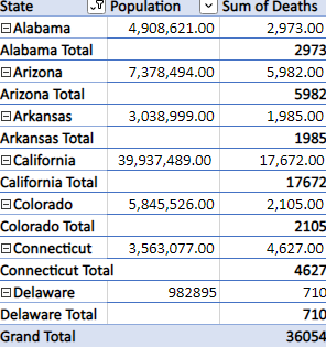
The next question that I had was " How does state population correlate to the number of deaths that occurred in that state due to covid-19". A pivot plot was used to answer the questions.
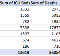
Lastly, after reading articles that ICU beds were extremely limited during the peak of covid-19, I wanted to see if there was a correlation between the number of ICU beds in the state and the number of deaths each state had. To find an answer to this a pivot table was created.
Visualizing
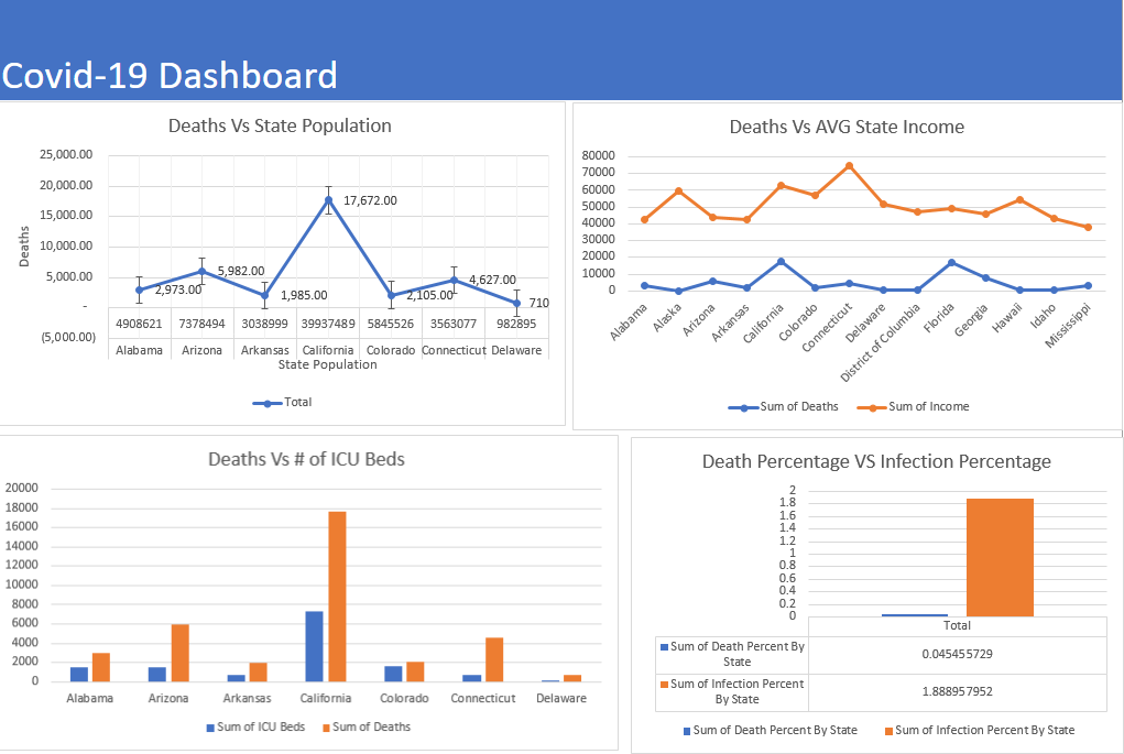
The charts and graphs from these pivot tables are located in the Covid-19 dashboard at the top of the page.
Findings
As you can see from the chart the findings for the first question "Does poverty have an effect on your likelihood of dying of covid-19" were that there is a slight negative correlation between income and deaths (the lower the state's income the more deaths the state will have).
Findings from the second question "What is the comparison between infection percent and death percent" can also be seen in the graph listed in the dashboard. What can be stated from the data in the graph is that your chances of dying from covid -19 after being infected are fairly low. This does not take into account the long-term effects that this disease causes which can increase the death percentage in the future.
In the third question "How does state population correlate to the number of deaths that occurred in that state due to covid-19" we can see what is the strongest predictor of death from covid-19. What the graph shows is a strong positive correlation between state population and the number of deaths (the higher the population, the more deaths a state will have).
The last question which had a look at the correlation between the number of ICU beds and deaths from covid-19 had some interesting findings. Looking at the graph that was created from the analysis that was done in the pivot table the correlation did not seem to support what I thought it would. The finding was that the more ICU beds a state had the more deaths a state had as well. This is likely contributed more to the population of the states as states with higher populations will have more ICU beds but also higher deaths as stated in an earlier analysis.
.png)